Yummly
Yummly Smart Cooking Platform
Designing connected experiences across smart hardware and mobile app
Role:
Senior Product Designer
Team:
Product Manager,
Engineers,
Visual Designer,
UX Writer
Duration:
2 months
OVERVIEW
Yummly's smart cooking platform connected a mobile app with smart kitchen devices. But the experience was fragmented. Users cooking with both the thermometer and smart oven had no unified flow. I redesigned the cook setup experience end-to-end, creating a consistent, guided journey across all devices and proteins.
WHAT'S YUMMLY?
Smart cooking made easier through connected devices
Yummly is a smart-cooking platform offering personalized recipes, guided cooking, grocery delivery, and integrations with connected kitchen devices.
About Yummly:
Personalized recipes & meal planning
Guided cooking with temperature tracking
Integrations with smart kitchen devices
Part of the Whirlpool ecosystem
20M+ users
2M+ recipes
2017 acquisition by Whirlpool
PROBLEM
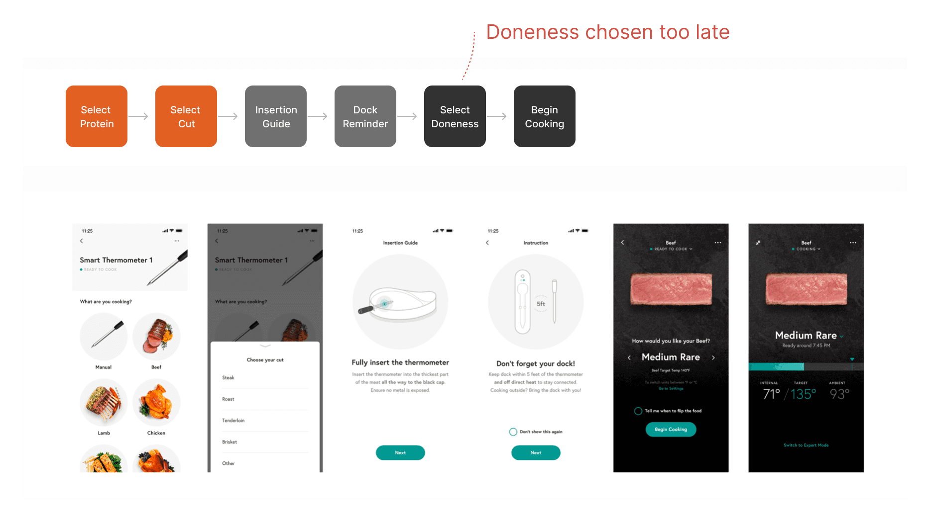
A fragmented cooking flow created friction.
Home cooks using both the thermometer and smart oven expected one seamless experience, but the app’s flow wasn’t designed for multi-device cooking.
Key problems:
No full control of oven from app
Inconsistent setup flows
Doneness selection came too late
No contextual guidance across proteins/cuts/appliances
Device owners expected more intelligence
Key Insight: Users didn't want automation alone. They wanted clear, consistent guidance.
Original Cook Setup Flow
SOLUTION
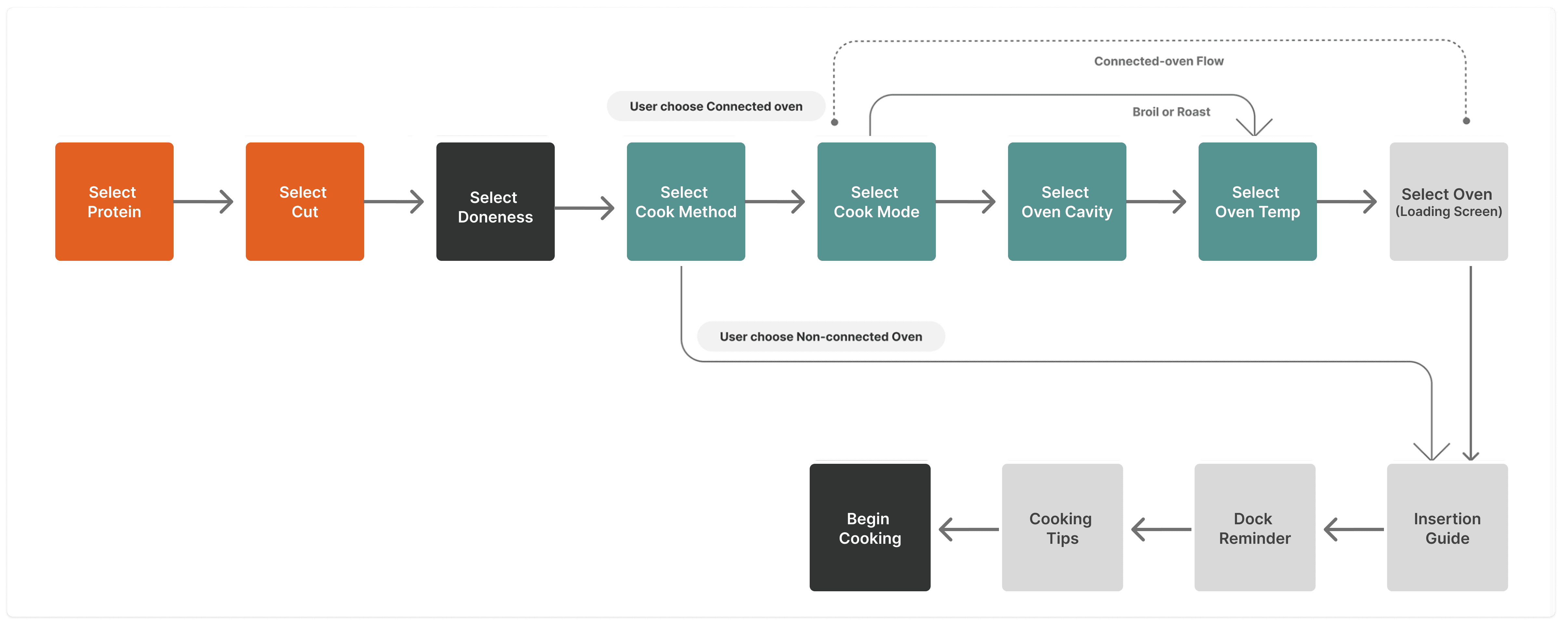
A consistent, guided setup across every protein and appliance.
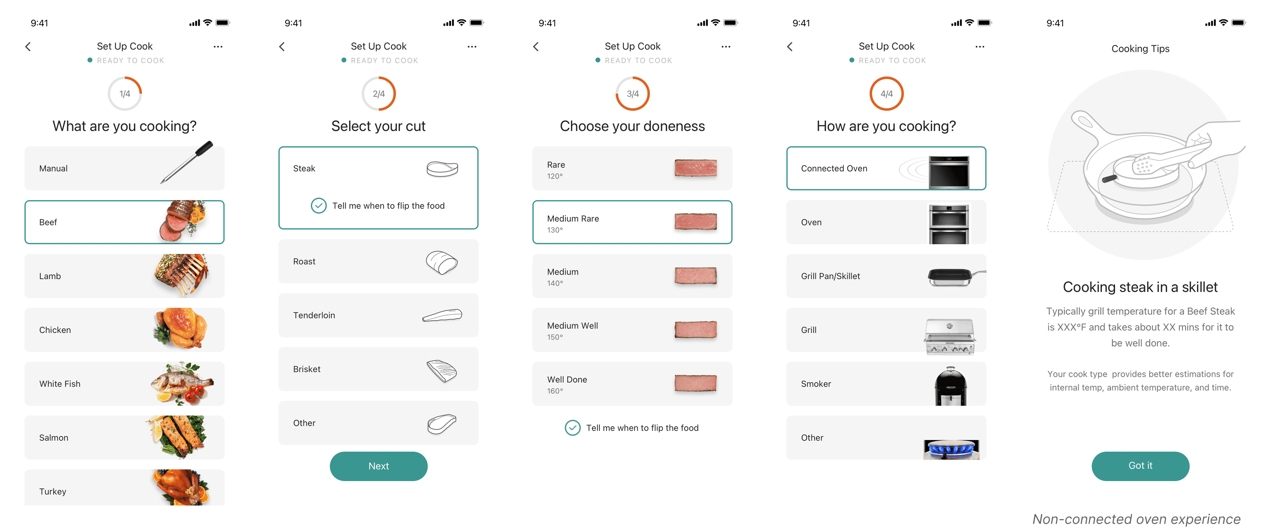
The redesigned cook setup flow moves doneness selection earlier, unlocking smarter, contextual guidance before cooking begins. Whether using a connected oven or standalone thermometer, users follow a clear, predictable path with no dead ends or missing steps.
But the launch wasn't the finish line.
ITERATIONS
Two concepts tested. One clear winner.

Early explorations tested two approaches: an accordion view showing all steps at once versus a one-step-at-a-time flow. User testing showed the step-by-step approach built more confidence.

We also tested image sizes for protein selection. Smaller thumbnails with labels won over large images alone.
RESULTS
A unified cooking experience that reduced friction and built user confidence.
The redesigned flow shipped as the standard setup experience across Yummly-compatible Whirlpool devices. It delivered consistent guidance across devices, reduced setup confusion, and supported Yummly's cross-selling goals within the Whirlpool ecosystem.
Measured outcomes:
Connected devices using the redesigned flow averaged 4.0 to 4.5 star ratings across BestBuy, Amazon, and KitchenAid, with ease-of-use consistently called out in positive reviews.
Behavioral KPIs (task success rate, time-on-task, user error rate) were instrumented to measure setup flow performance specifically.
Monthly retention reached approximately 20%, a baseline that informed subsequent iterations.
REFLECTION
Good hardware experiences fail without software that matches them.
Designing across physical and digital touchpoints taught me that consistency isn't just visual. It's about making users feel equally confident at every step, regardless of which device they're using.
Three things this project reinforced:
Guidance beats automation. Users didn't want the app to think for them. They wanted it to show them how to think. Every design decision that made the path more predictable landed better than the ones that tried to be clever.
Sequence matters more than surface. The winning flow moved doneness selection earlier, not because the screen looked better, but because the order unlocked smarter guidance downstream. Design decisions about when something happens often matter more than how it looks.
Test the interaction model, not just the interface. Accordion versus step-by-step looked like a layout question. It was actually a confidence question. The right answer came from watching people cook, not from reviewing screens.